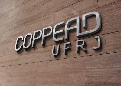
COPPEAD Branding
COPPEAD UFRJ
COPPEAD is the Graduate School of Business at the Federal University of Rio de Janeiro (UFRJ), located at the Campus of Ilha do Fundão. I have worked as a designer in the Communication Department of COPPEAD for more than two years around 2013-2014, and had the chance to redesign their brand.
During the redesigning process, the new brand was approved and incorporated into the Institution by the directorship, becoming a model of an actual rebranding case and also my Final Project at College.
The brand’s history
COPPEAD’s brand has had a fascinating journey. For the first ten years, the brand appeared in various formats, combining a serifed typeface with Minerva, the Roman Goddess badge that is part of UFRJ’s symbol.
In 1997, the management team decided that having an official brand was somewhat important, but it didn’t come as expected: the agency hired to design their logo came out with a copy from Epcot’s brand. COPPEAD sued them and had their money back due to the plagiarism.
In the next year, they finally got their own brand, and it carries a lot of the futuristic trends from the 2000s, such as globes, planets, new age, and so on. However, after 10 years it felt old and obsolete. The boarding team had a conservative vibe and wasn’t inclined to make big changes to their logo. With some insistence, the globe was removed, keeping only the typographic part. It wasn’t enough, though. They needed actual change, they needed a timeless, modern brand to represent the institution.
In 2016, the management team changed. At the time, I was a mere design intern that wanted more than only to remove the globe from the brand. I wanted to redesign it from scratch and present the results as my College Final Project. With a bit of luck, the new team was on fire to make everything and anything happen during their mandate, and I submitted the idea. After discussing with them the next steps, they agreed to let me proceed, but they made clear the results could lead to nowhere if they didn’t like it in the end.
To begin with the logo creation process, various sans-serifed fonts were experimented with. Neue Haas Grotesk was the elected one, and I started to play around with its forms by writing COPPEAD. Neue Haas Grotesk is the original version of the old Helvetica from the 1950s, restored and turned into digital by the Type designer Christian Schwartz. It has the features that Helvetica lost over the years from one typesetting technology to the next. Below you can see the Regular weight of Neue Haas Grotesk Text version, of course, the complete font family contains more styles and comprehends different weights.


New types were created using the letter “U” bowl as you can see above. COPPEAD was getting a shape, and a ligature was formed between the “AD”, standing out the part of the text that refers to administration.

The next step was to include UFRJ at the logo. Tahoma is the typeface used on the logo of the Federal University of Rio de Janeiro, so the UFRJ would be written with this font, and then adjusted inside the grid.

The logo also needed a version combined with the UFRJ main logo. UFRJ actually has a confusing visual identity, since there are many different versions being used out there. The registered official version of the logo is the one that has the University Crest plus the Universidade do Brasil text, therefore this one has been chosen for designing the combined logo version.


Grey was the elected colour for the logo, following the codes above. The Silver Pantone (877C) could be used for printing materials, such as business cards, books covers and brochures, since it gives a fancy clean look.

As part of the branding, some graphics were created to add charm and more different ways to explore the brand across different media. For the creation process, a very nice picture taken from the front of COPPEAD’s building was elected, then its shape was vectorised, resulting in a very interesting outlined illustration of the campus.

Once approved by the team, the brand was applied across various products and media, such as stationary and business cards, laptop and tablet cases, backpacks, pens, and indoor and outdoor signs.