Betting Picks
UX UI Bookies.com Fun Project
Context
The Bookies EDGE Sales Page redesign project happened in June 2021. Bookies.com was launched in 2018, when acquired by the GDC Group (former Kax Media Ltd), where I’ve been working full-time since. I was Bookies’ first UX/UI Designer and Lead, being mostly the only designer working on it.
The Objective
There was already a Sales Page in place, but it was changed so many times by stakeholders through direct requests to Product Owners and Developers, that most of its original design and essence was already gone.
As a result, the Sales Page wasn’t providing the information users needed when making a decision to purchase our Subscription Plan, neither it was following UX best practices.
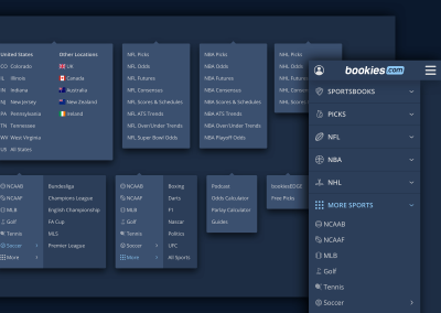
The product offered in this case is called BookiesEDGE. Users subscribing to EDGE can access our team of expert betting picks for a wide range of different sports. They can choose between Annual or Monthly Subscriptions and access the betting picks recommended by the “Handicappers” via email, SMS, or directly in their member area on the site.
Handicapper (or just capper) is the terminology used to call these sports experts in America (our main geographical target), and they’re called “Tipsters” in Europe.
The ticket requirements stated that the Sales Page had the main following goals:
- Explain what BookiesEDGE is
- How much the Subscription cost
- What are the benefits of our product
This is a good start, but not even close to filling the current gaps on this page.
User Research
Assuming the current page lacks in answering the main questions users might have and potentially doesn’t seem very convincing, I decided to run user interviews and user testings of our current page. Unfortunately, the company did not allow methods for reaching out to the real users that visit our site for several reasons, nor was willing to finance that type of research. At the time, we had a subscription plan with UserTesting.com though, so I’ve used that platform to find people that matched our target via screener questions and I was then able to finally run a user testing and gather insights.
I’ve tested the desktop and mobile versions of the bookiesEDGE page.


These are the demographics (based on the information provided by Google Analytics)
- Men
- 25-45 years old
- United States — but only from the states NJ, PA, WV, IN, and NV. At the time legal sports betting was not legal in many states, so I chose to target the states where it is legal and where it’s been legal for the longest, to get better chances at finding someone that could represent a bettor that has paid for experts’ picks before.
Usertesting.com only provided 2 questions in our plan. I’ve tried my best to create questions that didn’t reveal the true purpose of the test to then be able to find the best matches of users.
Screener Question 1:
1. Which of the following apps/sites are you interested in the most? You can only pick one answer.
- Bookstores – Reject
- Pet Walking – Reject
- Sports betting – Accept
- Financial Planning – Reject
2. Which actions listed below better express your behaviour?
- I use my mobile phone to place bets on sports a couple of times a year just to have fun – Reject
- I place bets often and sometimes I do buy Picks from professional handicappers to help me bet on the NFL, NBA or other major leagues – Accept
- I place bets often, but I don’t buy picks from professional handicappers. Instead, I do my research and make my betting decisions on my own or with the help of my friends – Reject
- I only place my bets on bricks-and-mortar sportsbooks and I do my research and make my betting decisions on my own or with the help of my friends – Reject
- None of the above – Reject
With these screener questions, I was able to find people that are not only interested in sports betting but have actually purchased any sort of sports picks with professional handicappers before.
User Testing Questions
Scenario:
You are a sports fan who usually buys picks from professional handicappers/sports experts to make a more informed betting decision. You are doing your picks research and you want to find the best option for you before getting committed to a picks pack or subscription.
At this point, the user only saw a blank page and is now ready to answer the first question. The reason why I did that was to collect raw insights from users before biasing them with the webpage.
Questions:
1. Please describe what is the key information you’re looking for in a Paid Picks pack or subscription. Please explain why and how this information would convince you to make a purchase. You can be as detailed as possible.
2. Launch URL: https://bookies.com/bookies-edge
You have been taken to this page. Please describe how you feel when going through this page. Please do not leave this page during the whole test.
3. Can you describe what this page is for?
4. Would you feel confident signing up for this service? Please explain why.
5 – Imagine that you have a magic wand that lets you make this page the way you think it should be. What would you change, how this page would look like and what information would you show? You can be very detailed, describing exactly how this page should look and the information it should have.
6 – Please tell us if you have anything to add.
I’ve gathered 5 participants for the mobile version, plus another 5 for the desktop version.
Asking users what information mattered to them when deciding to purchase picks resulted in a lot of good insights. Most of the user needs input was given on the first question, but some of them could also be spotted on the next following questions.

During the test, the users verbalised that these were the following questions and/or piece of information they would like to know or to see when they seek for paid picks:
- How much do the picks cost?
- What sports do the handicappers cover?
- Who the handicappers are and why they are considered “professionals”?
- What kind of analysis do they to decide which picks are good?
- What are the Handicappers’ records (win percentage, wins x losses, for example)?
- How much money they can win versus the betting stake and the cost of the subscription
- How are the picks are shared? How is the process of getting a pick? Would the picks come via email, text message or could you find them directly on the site?
- What is their Picks History? An example would be some sort of diagram or any indication of previous picks to let them find a pattern of wins and losses
- What would be each handicapper’s specialty — which leagues (and even teams) they are best at making picks for?
- They would like to see the Handicappers displayed in some sort of contest, to see which one is doing better
- Users’ Testimonials would help to find out what other users are saying about the handicapper or product
- Honesty and transparency are the key elements in their picks history/records
This was the overall input from users once going through the page presented to them:
- Some users were a little confused about how much you are actually charged per month or year — the pricing wasn’t super clear
- Most users considered the price wasn’t bad at all, but they could also have been confused regarding what the prices actually meant
- Some users would prefer to buy a picks bundle per season or per sport instead of getting a monthly or annual subscription
- Nearly all users said the page lacks some core information about the handicappers, such as the handicappers’ records and the picks history
- A few users did not feel confident to subscribe to EDGE, considering the lack of information about the handicappers they would be buying picks from
- Most users felt the site looked trustworthy, BUT they said they would only go further with a subscription once finding out more about our handicappers and their history/records — this emphasises the importance of showing more information about the handicappers.
- Most users were glad to see the pricing plans at the beginning of the page.
- Most users thought the page looked nice and typical considering what they are used to, and that the design and colour scheme was enticing.
- Most users wanted to browse the rest of the site to find out more about Bookies. They refrained themselves from leaving this page because the test explicitly told them not to, since the focus was the Sales page.
- All users understood quickly the purpose of the page — “Here I can pay for a subscription to get handicappers picks”. What really lacked on the page was more details about how and why users should do it.
Also, after analysing the people that actually would pay for picks, we were able to build a persona that could represent consumers of that specific service of our product:

Competitor Analysis
These are some competitors or similar sites. They helped me see what other sites are doing when selling or providing picks. I took a screenshot of each one of them to get insights and find patterns of how to address the picks subscription idea.
- https://www.actionnetwork.com/pricing
- https://www.sportsline.com/join/
- https://experts.covers.com/picks/allactiveproducts
- https://www.pff.com/subscribe
- https://flippick.com/
- https://www.sportsbettingdime.com/plus/
- https://www.gameadvisers.com/
- https://www.docsports.com/free-sports-picks-predictions.html
- https://www.predictionmachine.com/
- https://www.oskeimsportspicks.com/
- https://www.wunderdog.com/
- https://www.capperspicks.com/
- https://www.markedsports.com/
- https://www.thesportsbetexpert.com/subscriptions/
- https://www.scoresandodds.com/premium
- https://krackwins.com/
- https://www.sportscapping.com/
- https://www.vegasinsider.com/membership/signup/
- https://www.scoresandstats.com/premium/
- http://www.dynamitepicks.com/products-page/
- https://www.wagertalk.com/picks
- https://www.torneo.ca/
- https://www.betsperts.com/tips/0
- https://www.vigitapp.com/

The Plan
The idea is to bring to life the user needs addressed in the test and some value propositions ideas seen on competitors sites.
Actionable points
- Make Pricing Plans easier to understand
- Make sports coverage more clear
- Display the handicappers, showing their faces and their records (with a link to their page)
- Add Testimonials
- Somehow show their profit — the win versus the betting stake and the cost of the subscription
- Explain the process of subscribing and getting picks
- Show the benefits of subscribing to bookiesEDGE
- Reinforce the transparency in which the picks record is maintained
Potential Blockers
- Once talking to the Developers and the Product Owner, we realised we are not able to display picks history, unfortunately—the amount of data brought to this page would affect the page speed. We could show a link to the picks history instead.
- We couldn’t really make the handicappers displayed in some sort of contest, as one user requested. The business decision would not be to put them “against” each other, especially considering they were part of the same subscription plan.
- Testimonials need to be gathered with real users. We are not entirely sure if we can get them, but we are including these in the designs and will try to actually get that data with them.
- The business decision was against changing the pricing plans to make them also available as a bundle per season or per sport.
- Initially, I wanted to display the information of “how much money they can win versus the betting stake and the cost of the subscription” in an interactive manner, but because that would require a lot of development time, for now it will be just an image.
- There were a lot of changes in planning regarding new handicappers being included into EDGE at that point., that didn’t interfere a lot yet, but it could be a blocker depending on the number of handicappers and the possibility of showing their images on the site since some of them are freelancers.
Wireframes
The User testing and the competitor analysis provided some really helpful insights to start creating wireframes. I’ve sketched rough ideas and constantly iterated them until I was happy enough with the way the information was laid out. Here is a really busy example of my wireframes and notes.

This very rough wireframe has been shared with stakeholders for feedback, and considering some adjustments in place, I then moved to the mid-fidelity version, using the Sketch software.

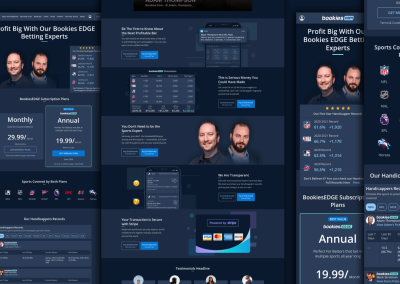
High fidelity designs
The wireframes were approved and moved forward with the high fidelity designs. Another blocker appeared—we’ve got 4 handicappers confirmed to go on the page, but 2 of them were freelancers and we could not use their images on the hero section.
That version was not 100% accurate to what would be live on the site, since there could be other decisions affecting which handicappers would or would not be displayed on the hero section of the page. For now, I used then only the handicappers images that I was sure about — Adam Thompson and Dan Kilbridge.
Also, I had to create the whole content myself just to be able to test this page. Obviously, this would not be the final content on the live site, but it would help the content editors to produce the real copy to resonate with the ideas shown in each section.
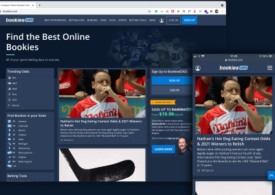
This page doesn’t need to be real yet, but it needs to look real, like a façade. This way, I’m able to run a test again using Usertesting.com to get insights of this stage of the designs and see if any major usability issue comes up.