Timeline Feed
Project Context
I’ve worked on this project for Bookies.com in 2021, and I was this website’s first and mostly only designer at the time, once the site was acquired by GDC Group, former Kax Media Ltd. I worked on this website from its launch in 2018 until March 2022, when I moved to a different team.
A few factors led to the execution of the Timeline Feed project. Business Stakeholders were constantly bringing feedback that the homepage felt static and not very exciting. Users also often couldn’t describe exactly why, but just that they missed the feeling of getting fresh information and data, considering how eventful the sports world is. At the same time, Google Analytics provided the information that the time spent on this page was very little. Some sports websites looked at for inspiration during this project conception were Covers, ESPN, Pro Football Focus, Action Network, OddsChecker.
The thoughts were that it “feels like some of these sites have so much going on that they display the information chronologically, but also highlighting what’s hot”. The Bookies Homepage, on the other hand, was displaying data into sections instead, such as “odds”, “futures”, “articles” and so on, and the order of things never changed, making the homepage always look the same, despite having different teams playing all the time.
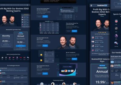
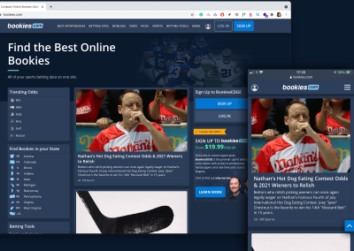
The image below shows how the homepage looked at the time, both for Desktop and mobile. It’s important to highlight that so much could have changed in this website since, that the live URL might look very different from what is presented here.

Once feeling like this could be the start of getting rid of the static feeling of the site and also potentially increase the time users would spend on this page, the project has been included on the roadmap, but the requirements were still up in the air, yet to be defined during the scope in the design process.
The Goal
The goal of this project as stated in the ticket requested was to transform the Bookies.com homepage into a time-sensitive sports hub website.
Bookies is a very big site, but the number of new articles released every day still wouldn’t be enough to make the homepage feel fresh at all times. Besides, Bookies is not mainly a news or article site — instead, its goal would be to provide mostly odds comparison from different Sportsbooks/Bookmakers, sports data and experts advice, hoping to help users make a more informed betting decision.
Meanwhile, at this stage, Bookies already had various features, such as Odds Comparison, Scores, Consensus Data, Sportsbooks reviews, Bonus Offer Comparison, Guides, News, and Experts Advice. It could then be a mix of all the stuff Bookies provide, but being hierarchically displayed considering the factors “Time”, “Trends” and “Potential Conversions”. Plus, we were only considering launching at first an MVP version (Minimum Viable Product), and that being said, we were considering exclusively features that we already had the backend in place to receive that data for. Any new type of data would have to wait, in order to use less development time for a first release as much as possible.
Here are all features Bookies provided already that we would potentially display on the homepage in a time-sensitive way:

Here are some other must-haves:

These points above are mainly to keep the page as SEO-friendly as possible. Google Rankings are really taken into consideration in this company, considering most of the traffic comes from google searches.
Some potential blockers to this project could be:
- It could take too long be implemented by developers
- We were limited by the data already available in the matrix from the sports data provider
- There were quite a lot of unknowns to this project considering the request was considerably vague
First Round Of Wireframes

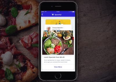
The image below was sent by one of our main stakeholders to try get the point across of what they thought could be valuable to have on the homepage. The word “Feed” was written at the top, but yet it didn’t feel that some sort of card grid would be ideal for literally a feed of fresh new data to be displayed at all times. Instead, I started to do some research on the most successful feed UX out there — the Social Media, such as Facebook, Instagram and Twitter.
Every social media platform shares some similarities. On mobile, their feed is an endless scroll of blocks stacked on top of each other. On desktop, their feeds also is an endless scroll of blocks, but this one gets usually concentrated in one of the areas of the site, like in the middle, and any other type of content that can be supportive tends to be distributed on each side of the layout.
Here you can see the wireframe I’ve done to represent a very basic structure of a social media feed.

We also have to consider that 75% of our users come from mobile, therefore all decisions to be made and all designs must be mobile-first.
For instance, when you design a component for mobile that must fit a tiny area between 320px to 425px, and you then have to translate that same component on a Desktop area of over 1024px, there might be discrepancies between the 2 components. Sometimes, having to tweak the mobile component to suffice the desktop area is really unavoidable, and the main cons are usually just more development work and more components that will make your Design System and UI Kit library busier with elements.
However, we are about to design a timeline feed here. Breaking down the desktop view in these 3 columns makes each of their width much closer to a mobile width area, therefore vast majority of those components are going to be the very same for mobile and desktop, which means less development work, more consistency across different screens and a less components to maintain in the UI Kit library.
At this point it gets easier to start organising where each piece would go inside this layout, as the next wireframes present.

These initial rough wireframes were approved by stakeholders and didn’t really offer any development or SEO blockers. Now, the big question was what to exactly display inside that timeline feed itself. We knew, based on the requirements, that we wanted to display whatever was newer and trendier first, and that we would not have super fresh content coming at all times. We wanted also to display all useful data we had available in the matrix from the sports data provider. The next step was to really map these components.
In order to map these components, I’ve started sketching out what they could potentially be, and began to question a lot of things:
- Given the idea that a resulting feed block could be the mix of an article with data attached to it, what exactly could be the data attachments?
- Do we always need an article attached to something on a feed block, or could that be just an aggregate of data?
- Considering all the different types of information and data we want to show in the feed, what exactly get attached to what?

This sketch was a more polished version that came after a lot of sketches were iterated and discarded. Also, this was done in some sort of “opposite” way. First, I’ve tried many times to lay out what I thought we wanted as a resulting component. Then I started breaking down what components were actually involved in crafting those resulting components. This is the perfect example of the Atomic Design Principle, which I’ll talk later.
This rough sketch really helped to visually communicate the progress of the project and naturally more questions were raised. Once able to map these components, a new components sheet was done, but this time in medium fidelity, using the Sketch Software as you can see below.

This component sheet was a more advanced stage, but still in mid-fidelity, which helped narrowing down through wireframes which components were going to be needed to build the feed. You can see next the mid-fidelity mock-up for mobile and desktop I was able to build using exclusively the components from the sheet.

The logic
The next step was to define the array of rules in which those building blocks would connect and behave on the site.
- Whatever is newest and requires a publish to appear in the site (Line Movements, EDGE Experts Picks, Podcast, News, Guides) will be shown first
- Our Internal CMS that controls and feeds the company’s websites would have to create new data fields to allow the correlation between articles and leagues, teams, picks and etc, thus once an article was published, it would also show the data attached to it automatically. Knowing that this request would need to be made to the CMS team at that early stage was crucial to hit the project deadline.
- The timeline feed will have 10 blocks (not considering the conversion blocks that appear on the feed on mobile and as a sidebar on desktop) before a “Load More” button.
- For every 3 blocks, we show one conversion block.
- Before the load more button, we must show an upcoming games block as its own thing for a certain league if none has been triggered by an article before
The Atomic Design Principle
“Atomic design is a methodology composed of five distinct stages working together to create interface design systems in a more deliberate and hierarchical manner.
Atomic design is not a linear process, but rather a mental model to help us think of our user interfaces as both a cohesive whole and a collection of parts at the same time. Each of the five stages plays a key role in the hierarchy of our interface design systems. Let’s dive into each stage in a bit more detail.”
The five stages of atomic design are:

I’ve long embraced the Atomic Design Philosophy from Brad Frost in my designs since it reinforces consistency and simplifies the design and development process through constant replication of components as if they all live as a happy family.
You can see the schemes of how the hierarchy “Atoms – Molecules – Organisms – Templates – Pages” will work in this project.


Considering the atoms are the simplest parts that composes the design system, such as icons, links, buttons, text styles, etc, I’ll skip those and move straight to show you how this projects’ molecules were structured on my Design System using Sketch, as displayed by the image below.

To give you a deeper level of detail, the following image contains all molecules built for this project. This image was taken from my own documentation and this was really helpful to keep track and up-to-date as new components needed to be added in the future or removed, as well as a good place to reference how each of them was meant to work.

By making use of those molecules above and some atoms, we are then able to mix and match them to build the next level of components, the Organisms.

Again, an image taken from my own documentation to show all Organisms designed using the presented Molecules and Atoms.

The Template, as one of the surface-level items in the design system, looked like the image below. That Template was originally created for the main homepage, but was also replicated to other Pages, like the NFL Homepage, the NBA Homepage and other leagues Homepages as well. This is how the hierarchy “Atoms – Molecules – Organisms – Templates – Pages” ends cohesively.

The Final Product
The final mock-up looked like the image below, for mobile and desktop

To give you a more realistic view of how the project looked once it was built by the developers, here is a screen recording showcasing the real website.
One of the main takeaways I’ve taken from this project was how efficient the communication between myself – the designer – and the development team could be by using the following strategies:
- The Atomic Design System combined with a powerful visual documentation to be inspected by developers.
- Mapping Scenarios to use always the minimum number of Atoms, Molecules to build a wide variety of Organisms easily replicated by developers once built.
- Recording design walkthroughs using any screen recording software to properly explain to developers and stakeholders how the designs are meant to work. This really made the flow of feedback be quicker and also helped developers build interfaces as close as possible to the designs.


